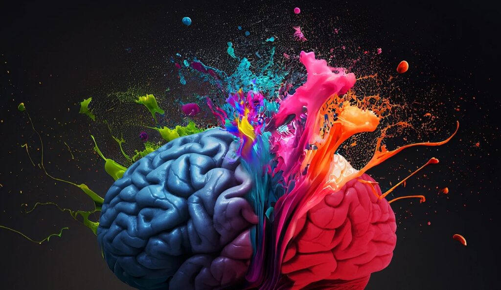
Color is far more than a visual aesthetic; it is a silent yet powerful communicator that shapes perception, evokes emotion, and drives user behavior within seconds. In the digital realm, where first impressions are formed in a blink, the strategic selection of a color palette becomes a foundational element of brand identity. It’s a non-verbal language that can convey your brand’s personality, values, and promise before a single word is read.
The emotional impact of color is rooted in both psychological principles and cultural context. For instance, blues are universally associated with trust, security, and calmness, which is why they are prevalent in sectors that require building confidence. Conversely, reds can trigger excitement, urgency, or passion, making them effective for calls-to-action or brands seeking to appear bold and dynamic. Understanding these subconscious triggers allows marketers to align color choices with desired user responses.
Moving beyond primary colors, the complexity deepens with shades, tints, and combinations. A deep navy blue communicates professionalism and stability, while a bright turquoise feels more approachable and creative. The contrast between colors used for backgrounds, text, and buttons directly affects readability, visual hierarchy, and user experience. A poorly contrasting palette can render a website unusable, while a harmonious scheme guides the eye effortlessly.
Practical application begins with defining your brand’s core attributes. Is your brand modern and innovative? A palette of sleek black, white, and a vibrant accent color like electric blue or magenta may be suitable. Is it natural and organic? Earthy greens, soft browns, and creamy whites will better convey that message. This strategic alignment ensures that every visual touchpoint reinforces the intended brand narrative.
However, color psychology is not a rigid rulebook but a framework for informed decision-making. It’s crucial to consider industry norms, competitor differentiation, and A/B testing. A call-to-action button in orange might outperform one in green for your specific audience, regardless of general principles. Testing different palettes on key pages is essential for optimizing conversion rates and user engagement.
Ultimately, a powerful digital brand uses color with consistency and intent. From your logo and website to social media graphics and email campaigns, a cohesive color system builds recognition and trust over time. It creates a memorable visual signature that helps your brand stand out in a crowded digital space, making complex psychological principles work quietly yet effectively in the background of every user interaction.

